Introduction to Visual Design Principles
Preface
Whenever I think of design, or good design, the following quote always comes to my mind:
“ There isn’t such thing as good design, there are only good designers”
If you’re familiar with or enthused about designs, you would know that good designs are subjective and cannot be measured in a finite way. Certain design that might tickle your fancy might not resonate well with others. Also, in this ever changing environment where the world moves from highly animated and graphics intensive design to minimalism in the blink of an eye, the quote above sounds exceedingly convincing.
I would even go so far as to say that all designs are impressionistic account of the imagination of the designer’s innovative, or artistic abilities ,that while fulfilling its purpose, is also able to appeal and astonish.
A design must be
Mobile First:
Your design is worth nothing if it doesn’t cater to the 54%(approx.) of the population that browse the internet on their hand-held devices.
Innovative:
A proper design must reflect some degree of innovation so as to make it stand out in a crowd of other designs.
Functional:
A design is nothing if it doesn’t serve its purpose.
Useful:
A design must make the procut useful by neatly emphasizing on the practicality of said product
Aesthetic:
The aesthetic quality of design is an important aspect as it makes the product rememberable and also enhances the effectiveness of the design.
Consistent:
Design elements must he cohesive, easy on the eyes and harmonious to create a beautiful design.
Honest:
A design must not oversell the user on promises it cannot deliver. It must be fully and in accordance to the functionality the said product provides and nothing more.
Long-lasting:
Design must be timeless, so that it never goes out of fashion. It should be inspiring for many years to come.
User Oriented:
Designs should be created with the end users in mind. Observing the design with the perspective of the end user helps to make it an effective one.
Thorough:
A design should not miss any portion of the product. It should be meticulous in presenting user with every single detail.
Easy Loading:
Less loadings, more fast and easy presentations.
As little as possible:
Minimalist approach can make your design look simple yet elegant, uncomplicated yet expressive. Less is better
Memorable:
A good design draws users back. Providing users with great user experience while also selling the product by concentrating on all the essential aspects of it is an ideal case.
A good designer is very familiar with and nails the very fundamental principles of designing. A visually appealing website sells. But a bad one can kill your business.
Let’s talk about how elements should be put together in a design and dive into the details of elements of design.
The Basic elements of design are:
Line:
Line is a mark between two points. There are various types of lines, from straight to squiggly to curved and more. Lines can be used for a wide range of purposes: stressing a word or phrase, connecting content to one another, creating patterns and more.
Color:
Color is used to generate emotions, define importance, create visual interest and more. Some colors are warm and active, others are cool and passive.
Texture:
Texture relates to the surface of an object; the look or feel of it. Concrete as a rough texture; drywall has a smooth and subtle texture. Using texture in design is a great way to add depth and visual interest.
Size:
It is how small or large something is: a small shirt vs an extra large shirt, for example. Use size to define importance, create visual interest in a design (via contrasting sizes), attract attention and more.
Space:
Space is the area around or between elements in a design. It can be used to separate or group information. We should use it effectively to: give the eye a rest; define importance; lead the eye through a design and more.
Shape:
Height and width together, create a shape. Odd or lessen seen shapes can be used to attract attention. There are three basic types of shapes: geometric(triangles, squares, circles, etc), natural (leaves, animals, trees, people, etc) and abstracted (icons, styles, graphic representations)
Value:
Value is how light or how dark and area looks. A gradient, is a great way to visualize value- everything from dark to white, all the shades in between has a value. Use value to create depth and light; to create a pattern; to lead the eye; or to emphasize.
The principles of design describe the manner in which the designer uses the elements in his work.
Movement:
Movement catches the user’s attention. Movement must be directed as to focus the user’s attention to focal areas of the design.
Pattern:
Patterns are repetitions of objects or symbols that can be used to make the design seem active.
Proportion:
Proportion is how well all the elements of design work with each other. A proportionate design is pleasing to the user’s eye.
Rhythm
Rhythm is created when one or more elements of design are used repeatedly to create a feeling of organized movement. Rhythm creates a mood like music or dancing. To keep rhythm exciting and active, variety is essential. Variety is the use of several elements of design to hold the viewer’s attention and to guide the viewer’s eye through and around the work of art. Unity is the feeling of harmony between all parts of the work of art, which creates a sense of completeness
Balance:
Balance is key to the creation of a nice design. The distribution of design elements such as line, colors, texture, space and other objects is crucial to make the design feel stable. Symmetry must be given a close look at while designing elements as symmetry models balance and balance in turn raises the visual appeal of the design. Not to say that other designs such as radial or asymmetrical designs do cannot be balanced, as they can be too.
Emphasis:
Prominence is given to important aspects of design so as to grab the user’s attention, usually reallized with contrasting it with other areas, be it using different texture, size, or color.
Thinking as a User
- Users appreciate quality and credibility of your webpage.
- Users don’t read, they scan. So, important texts must stand out. We must learn to prioritize.
- Web users are impatient and insist on instant gratification. We should make all the important features easily available.
- Users want to have control. While giving certain instructions is okay, constantly telling users what to do (eg sign-up) is not.
- Don’t Make Users Think. One question mark on user’s mind while going through your webpage, and the user experience has already gone down a point.
- Don’t Squander Users’ Patience. Lost of popups and ads degrade the usability of website.
- Manage To Focus Users’ Attention. Important features must be emphasized so as to grab one’s attention immediately.
- Strive For Feature Exposure. Honest portrayal of features of product is desirable.
- Make Use Of Effective Writing.
- Strive For Simplicity. Easy on the eyes. Less is more.
- Don’t Be Afraid Of The White Space. Negative or positive whitespace can breed innovation and make an okay design great.
For design inspiration:
- awwards
- uplabs
- dribble
- pages.xyz
- hoverstat
- collectui
- themeforest
- csszengarden
- html5up
- httpster
- front-end
Let’s look at some of the design wins and some design fails:
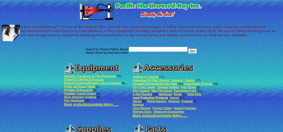
Extreme Fail
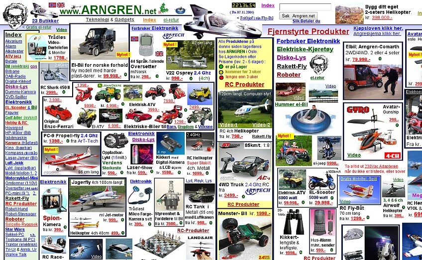
Basic and uninspiring design

Poor contrast
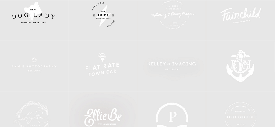
Not responsive
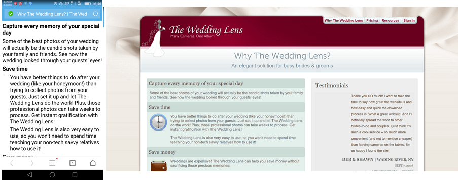
Poor use of color palette
Clean and simple
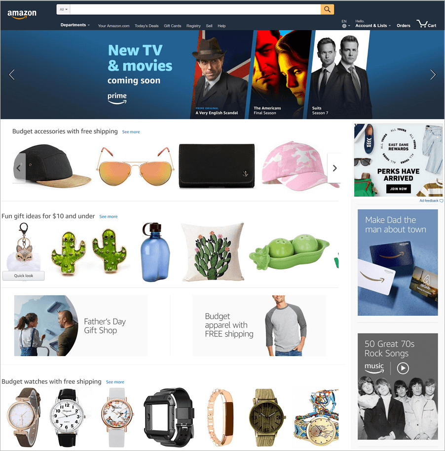
Good use of colors, consistent and balanced

Simple balanced and symmetrical

To the point, concise features and highly usable
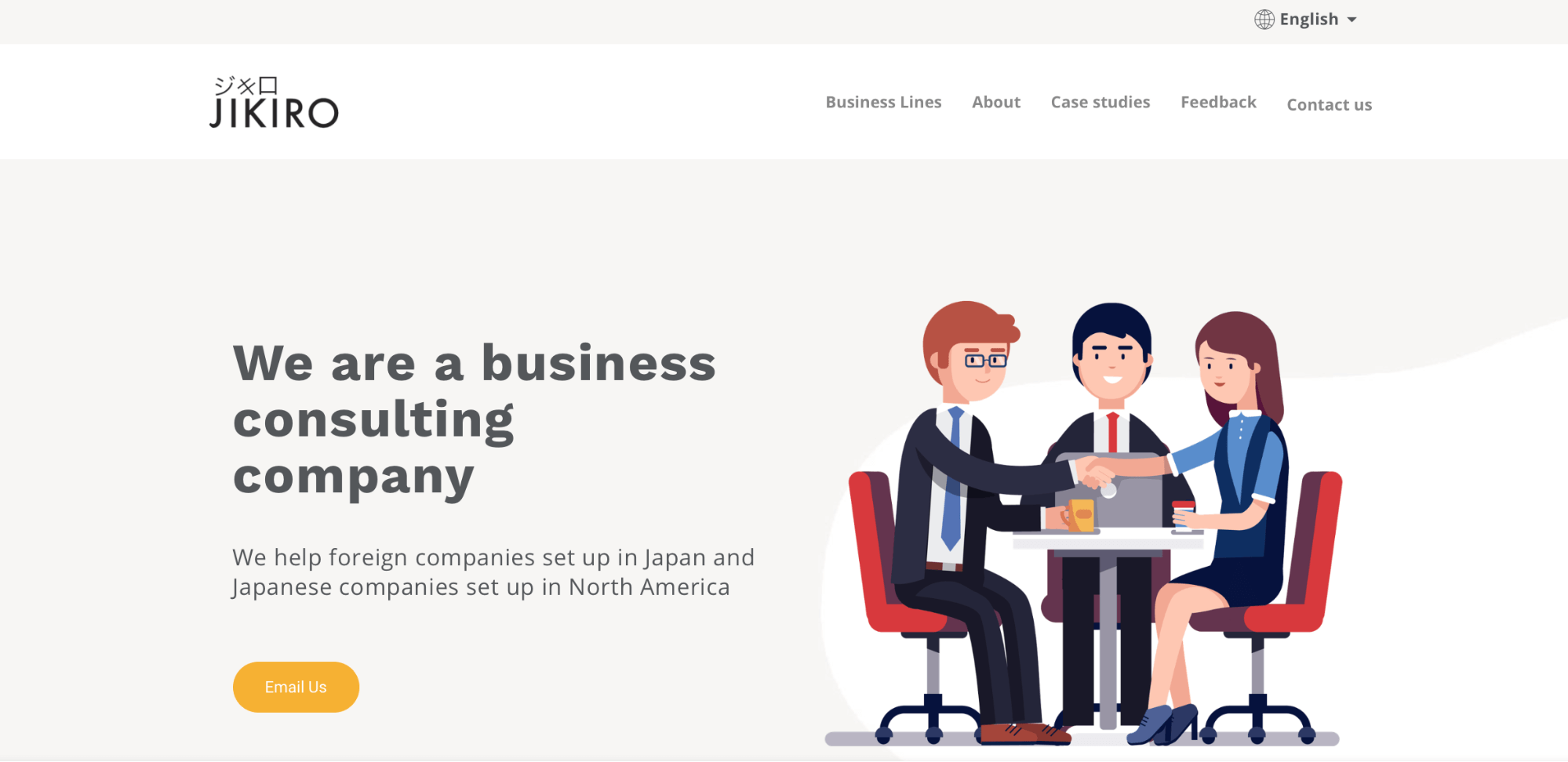
Balanced with clear navigations

Minimalist and symmetrical design
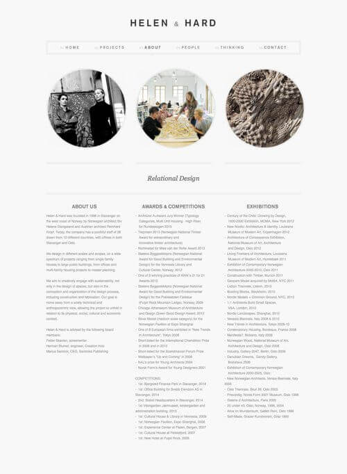
Consistent, good use of colors, and symmetrical
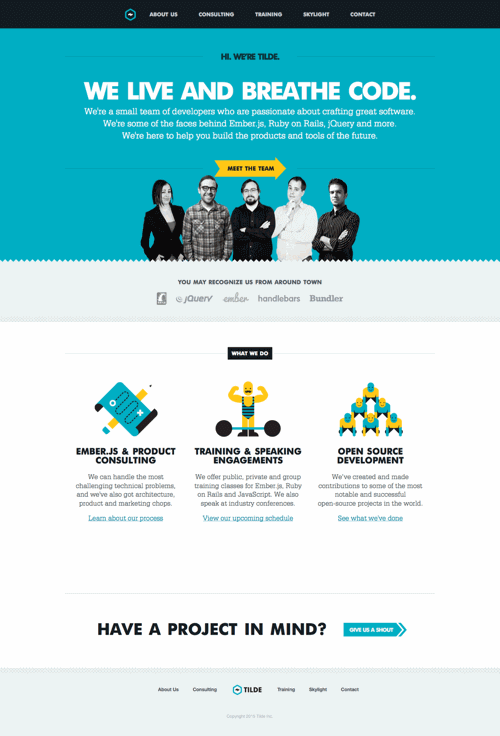
Asymmetrically balanced
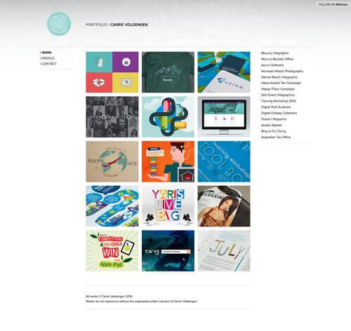
Asymmetrically balanced with a powerful picture
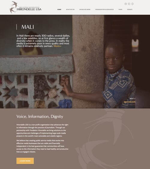
Radial balance
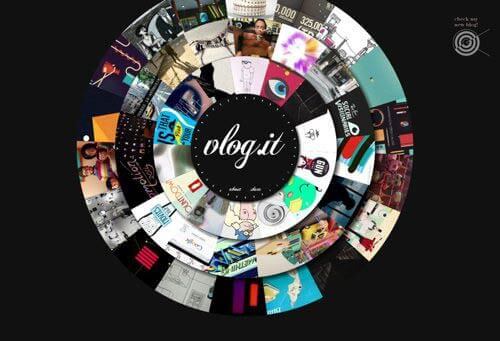
Radial balance
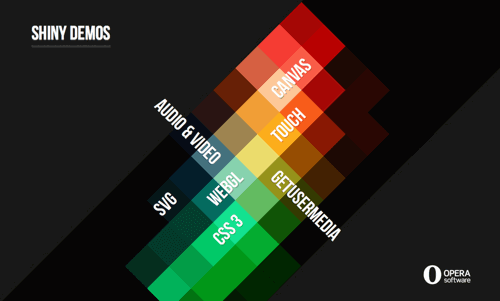
Mosaic balance
